
My medium is tin-glazed earthenware, but that doesn't matter much. I say it because some people are curious about how things are made.
Earthenware is a type of clay that's fired to about 1000 degrees centigrade By contrast, stoneware and porcelain are fired to about 1300 degrees. These figures are approximate, and there is a wide latitude. To be precise, I fire to 1100. Tin-glaze is a glaze made opaque with tin oxide. That was the traditional opacifier, but you can use other things as well.
Tin-glazed earthenware has a long history, originating in Iraq in the 9th century. It reached great heights in Renaissance Italy, where vases and plates were elaborately painted in the istoriato or story style. This phase of tin-glaze was called maiolica, probably because it first came to Italy from Majorca. The colours are from metallic oxides and the paintings are remarkable given that the painters couldn't get a red oxide. The nearest they got was iron oxide, which is basically rust, and that's the colour it makes on maiolica.
Tin-glazed pottery went to the Netherlands, where it also flourished, particularly at Delft in the 17th century, to the extent that it was called Delft. The Dutch had a different approach to the Italians, lighter, even frivolous. They particularly liked to make tiles in this medium, and there are many Dutch houses that still have fire surrounds in old Delft tiles. Well they might, as it's estimated that over a period of two hundred years the Dutch potters made eight hundred million of them.


That's a brief history, and needless to say I've spent a long time looking at old tin-glazed pottery. If you're travelling, there's a good collection of Delft dishes in the Rijksmuseum in Amsterdam, and the Museo Nazionale d'Arte Medievale e Moderna in Arezzo claims to have the most important collection of maiolica in Italy. (It's interesting that most of the istoriato dishes in Arezzo portray classical rather than Biblical scenes.) The consensus is that maiolica was past its best by the 18th century, but in Arezzo there are some 18th century dishes from Viterbo (never a great maiolica centre) showing domestic scenes, like a boy peeling fruit, painted in a loose style that appeals to me more than the tight painting on the grand istoriato pieces.
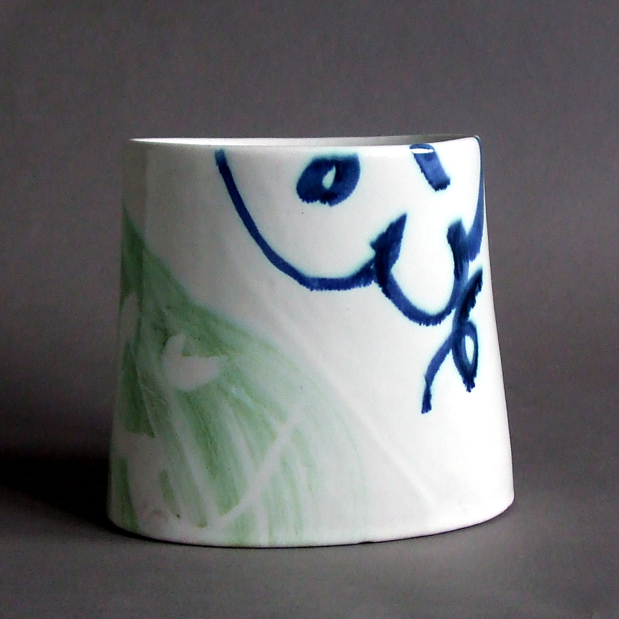
My reason for using this medium is that it's good for painting. You have a white background and you can use a wide range of colours. I only use six, blue, green, yellow, brown, black and red, but I have made them precisely as I want them. The range of stains available to the modern potter is much wider than that available in the past; new oxides and industrial methods have produced a vast palette. But the trouble with these commercial stains is that they were designed for the ceramic industry where predictability and stability are essential. This makes them too cold and dead for my liking and I prefer to use raw oxides, which blur and run and which separate slightly after they have been mixed. Red remains difficult: I still have to use a commercial stain, but I'm doing some experiments on getting red with raw oxides.
The traditional vocabulary of tin glaze is naturalistic, tending to fruit, flowers and birds, all of which have been beautifully treated in Delft and maiolica. But I have chosen purely abstract decoration, limiting myself to two or three colours on each piece. Combined with the white background, this gives quite enough possibilities for variation and contrast. Take blue and green: you can paint blue on white, white on blue, green on white, white on green, green on blue and blue on green – six combinations from only two colours.
The way I work is to construct each piece carefully, spending a lot of time scraping and refining the form, and then painting freely. This is a high risk method, because painting of this sort can't be corrected. If it's wrong, the only thing to do is to wash off all the glaze, dry out the vessel and glaze it again.
Abstract decoration is more difficult than fruit and flowers. Their shape is given and it's easy to arrange them on the object. My arabesques are infinitely variable and can easily go wrong. I have to get the shape right but it can't be planned or laboured. You have to work like a Chinese calligrapher, to see the shape before you on the white surface and then to fill it in with a quick sweep of the brush. The profile of the line is important as well. It's determined by the shape of the brush and the type of hair the brush is made of. Often the profile is wrong even if the form is right, just a bit too flabby. For that reason I'm always on the lookout for the right brush. It has to have edge and spring, or alternatively, rough bristles to make a dry ragged line. Sometimes only the best Kolinsky sable will do, sometimes I use an old glue brush with the bristles falling out that probably cost 50p. The broad washes of colour are usually done with a wide soft brush – Japanese hakes are good for that – but sometimes I want a dry, ragged wash, and use something rougher and stiffer. A watercolour painter was horrified when I told her that I use Kolinsky sables with these abrasive oxides or with gummy wax, but, hell, the purpose of a knife is to cut, not to be kept sharp.
I will be demonstrating at Childwickbury Arts Fair next weekend (Friday 6th to Sunday 8th July) where you can see how this is all put into practice.
Alan Caiger-Smith, Tin-Glaze Pottery, Faber & Faber, 1973
Subscribe to my newsletter

No comments :
Post a Comment